2: Your Day
The centerpiece of HQ is the Day. The goal here is to build a page that a user could use just like a daily journal, but in a digital form.
Sort of like this, but digital.
From Best Self Co
Physical journals are great, and many people use them (including me) for a variety of purposes. Some are like the above and have sections with prompts to guide the user and provide structure, while others are free form with either dots (my preference) or lines or even blank paper.
A typical dot grid journal
The Day Page
The goal with the Day page in HQ is to recreate the best parts of the physical journal, but in a digital form. It looks like this (below). The center column has prompts for what should go in your journal today, while the left sidebar has tabs to quickly jump around to other days. We'll cover the right column in a minute.
Day Page Sections
Each day has various sections that allow for text input or that connect to other activities done throughout HQ. By default (and for privacy and ease of viewing), each section is closed when you first load the page.
Free Form Text
Clicking on any one section will reveal its contents. In some cases, there is a space to write something, just like you would in a physical journal.
Linked Records
In other cases, the section links to records from other places in HQ. This is particularly useful if some of the things you would keep track of in a journal are calls you want to make or other outreach to people in your life. While you could just write down "- Call Dad" in your journal, doing it this way lacks useful context. When was the last time you talked to this person? What did you talk about? Has this task been completed yet, or not? etc.
A better design would be if your journal was 1) digital and 2) smart enough to reference your contact and pull in necessary information right where you need it.
Right Sidebar
For these linked records, clicking on them will pull up more details related to that record in the right sidebar, providing additional context.
This works for records of all types of data that HQ stores, including contacts, habits, meals, workouts, and more...
a really healthy snack there huh? :/
It even works for papers!
And, you can make them bigger too so it's almost like holding them in your hand.
The capability of scanning papers (taking a picture) is especially great because it allows you to get the best of all worlds. Use your physical journal for things where writing is preferred (there are many), and use a digital journal for things where referencing of data and the other benefits of digital is required (there are a lot of these too).
I personally draw a bunch of diagrams and wireframes of product and business ideas using my trusty dot grid journal. I've tried many digital products for this purpose over the years—mostly on the iPad—and none work nearly as well for me as old fashioned pen and paper. For these sorts of purposes, we don't need to reinvent the wheel.
But for other purposes like editing text you've written, a digital form factor is superior and certainly avoids the numerous scratch outs that I have with pen & paper.
Metrics
Lastly, as a person goes about their day, they're doing numerous things. Many self-help and personal development books such as Atomic Habits and others stress the importance of tracking the things you do. This is great for accountability and just for keeping track of what's been done and what hasn't. HQ tracks these activities automatically as you interact with it.
Currently, it tracks:
Communications
Contacts
Papers
Jobs
Workouts
Meals
This list is growing, as is the depth of tracking that each thing can perform.
Mobile
Most of this is available on mobile as well. Soon all of it will be.
Summary
The design objective the Day page is to have a single representation of all of a person's daily activities:
It needs to be powerful, but not visually overwhelming
It needs to be scannable so a person can use it to quickly find what they're looking for
It needs to provide more info about a thing when the user wants to drill down further
It needs to combine the best elements of a physical journal and digital one all into one
Hopefully, HQ is off to a good start hitting those objectives.
Why build HQ?
If you study the habits of peak performers — the people we look up to and marvel at how much they achieve — one common theme emerges: they all keep track of what they do. Why? …so they can do it better the next time!
You’re reading about an early prototype of HQ — the operating system for your daily life. HQ is being built in public and various aspects of the application and/or this blog post could change. This article originally appeared on Medium.
For more information, visit twitter.com/gotomyhq
We all aspire to greatness. HQ helps you achieve it.
If you study the habits of peak performers — the people we look up to and marvel at how much they achieve — one common theme emerges: they all keep track of what they do.
Every. Single. One. Of. Them.
Why? …so they can do it better the next time!
Here’s the problem
Keeping track of what you do is all well and great, but for many years I asked myself the question: how exactly do I keep track of all this information, and where do I store it?
For a long time, the answer to that question involved suggestions like keeping a journal or building a spreadsheet to log various activities, or various manifestations of these ideas. But with the complexity and connectedness of our 21st century world, neither of these approaches really work — I’ve tried both and a number of others too.
Today, a good portion of our lives take place online, so while a physical journal may be good for writing, it can’t capture pictures, video and other media, nor can we use it to do any data analysis, nor does it have any automation, or search capability, etc. It’s just writing.
As a digital tool, Excel (and Airtable, Notion, et al) has some of the right features, but it’s just a shell. We as the user are charged with building a model to house the data we want to track. Assuming we know how to do this at all, doing it is both time-consuming and unlikely to yield a system we can really use in the long run. And again, WE have to build it.
Here’s the vision
What if there was a system that was already set up for all of us to keep track of our lives just like the people we aspire to be? What if this system didn’t require that we have won super bowls or be a billionaire or be a celebrity or have a “person for that?” What if there was an app that let us manage our daily lives with precision, and keep track of every activity and detail we care about, from what food we eat, to the workouts we do, to the people we communicate with, and the stuff we have to do, to the things we own, even down to the papers on our desk?
Better still, what if we could get all these capabilities without having to use a multitude of apps and having our data spread out all over the place? Apple may have told us “there’s an app for that” but what we didn’t quite understand is they meant “there’s a separate app for that.”
What if there was just one?
Introducing HQ
HQ is the world’s first Smart Journal. It functions as the operating system for your daily life.
Every aspect of your day, organized and accessible
A list of your contacts and the communications you’ve had with them
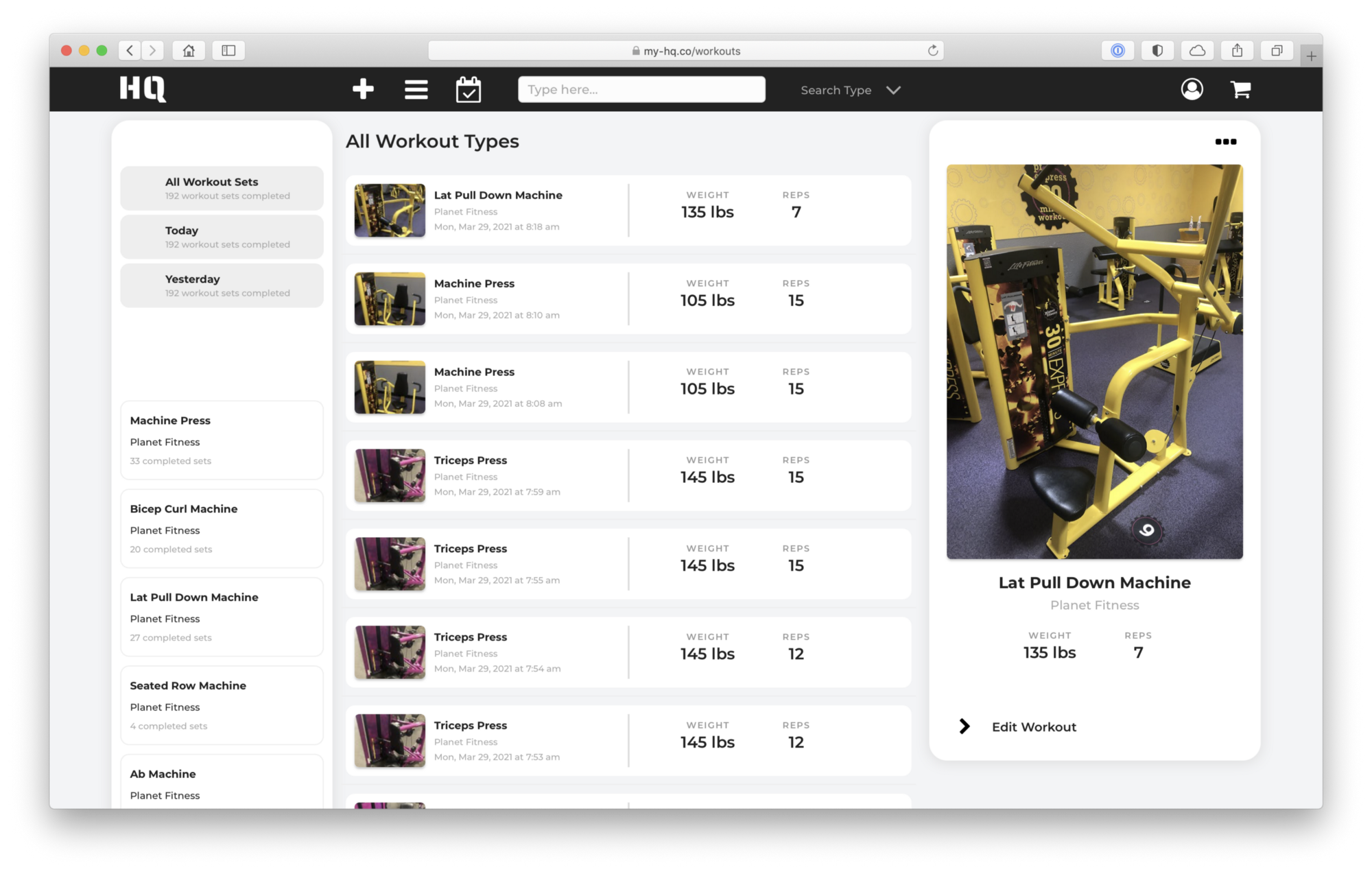
A place to log all of your workouts
Using HQ, consumers can record and manage all the important aspects of their lives from within a single space, all with the aim of helping them get better at whichever parts of life are important to them.
- Manage your contacts and the communications you’ve had with them.. even where you met them
- Log your workouts, down to the last rep
- Plan your meals and maintain a food journal, even including meals from restaurants
- Put together habit lists and track your daily performance as you complete them
- Check off tasks and get projects to the finish line
And a lot more … see more about how HQ Works.
One App. All of you.
We all have dreams. We all have a vision of a person we want to be. The people we admire for all that they accomplish have spent years building systems that help them execute at a high level.
Now you have one too.


